Designing for a Designer
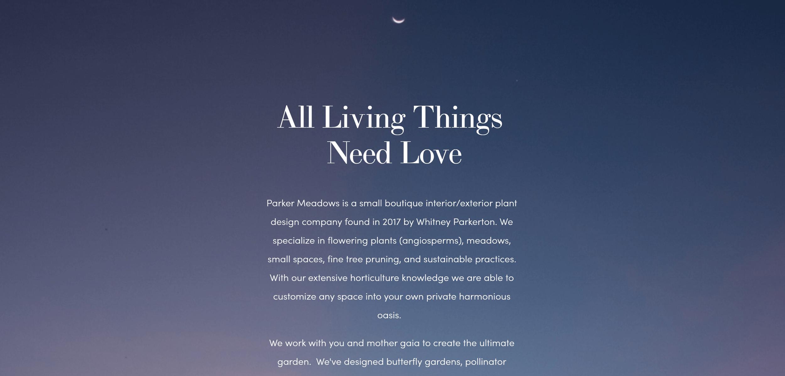
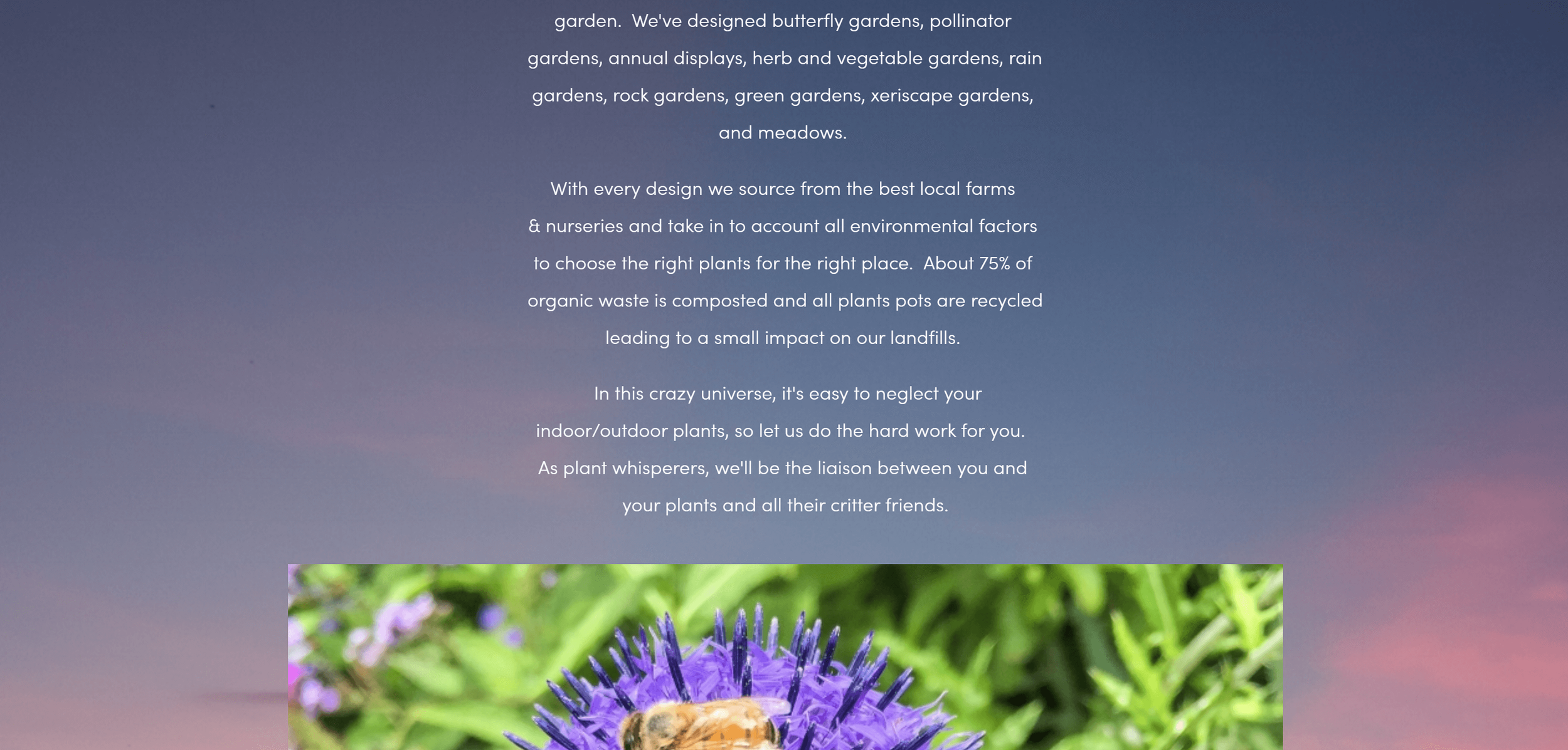
I was tapped by Whitney Parkerton, founder and master gardener of Parker Meadows, to redesign the website for her urban landscape design business. Her original website had been made in a hurry a few years before, and was due for an update that was more intuitive and better showcased her work.
Whitney’s original website included things she prized: pretty images of garden installations, blurbs explaining her mission and values, and also the practical elements: a list of her services and a contact page.
What it still needed, though, was cohesive branding, a more succinct introduction to her work, an archive of her past projects, and a look that was overall cleaner and easier to navigate.
The challenge to this project was working with a client who not only had business goals, but also a strong design aesthetic of her own.
To make the website work, I’d have to balance the performance needs of the website with certain design requirements, like eliminating the color white from the website and keeping the original fonts.
The Portfolio
A landscape design business relies on a portfolio to showcase style and expertise. Whitney’s original portfolio page was a few simple carousels of photos from various projects, but it lacked information about how she worked with clients to achieve her final results.
We completely reimagined her portfolio as individual project pages, so that potential clients could get a feel of the process from start to finish, as well as provide more room for all the beautiful images of her work.
Before
After
Services
Whitney initially allocated only a small section of her homepage for her services. However, realizing the need for more space to thoroughly showcase all she has to offer, we developed a brand new page for them that also answered common client questions, including what prices to expect.
Before
After
About
Whitney wished to convey the values and capabilities of her design business, but lacked a dedicated space to do this on her website, other than the introductory text of her homepage.
So we created an About page that not only emphasized her distinctive approach to garden design but also introduced the talented staff behind the scenes who make it all happen. And throughout this process we continued to incorporate large-scale images of her work.
Before
After
Contact
When I first got my hands on the Parker Meadows website, the Contact page was a mess. There was not one but two of them, both linked in the navigation bar, and a third contact form squeezed into a section of the homepage. To add to the confusion, each form requested different information.
To rectify this, we consolidated the contact points into one page and added plenty of images to boost visual interest.


